


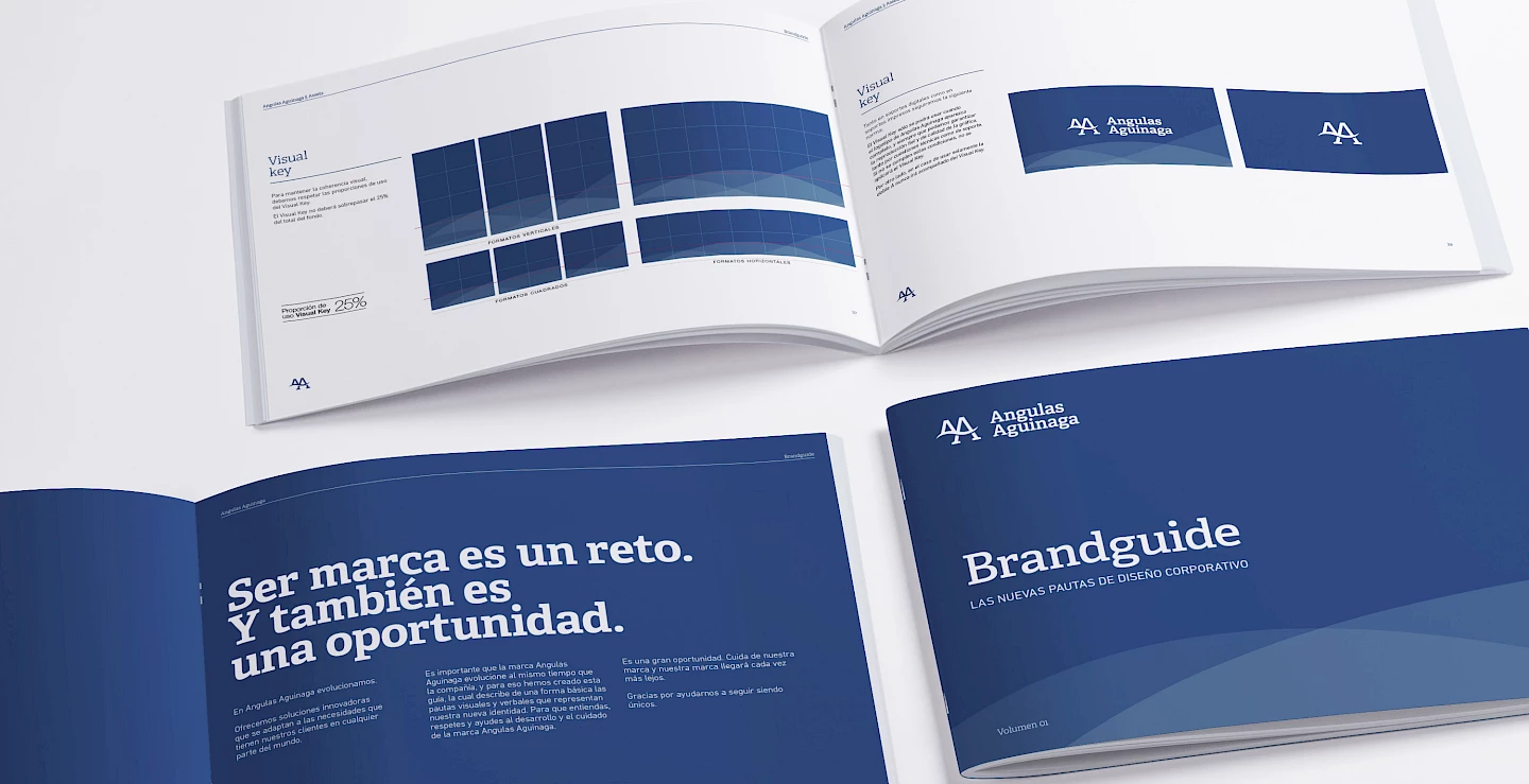
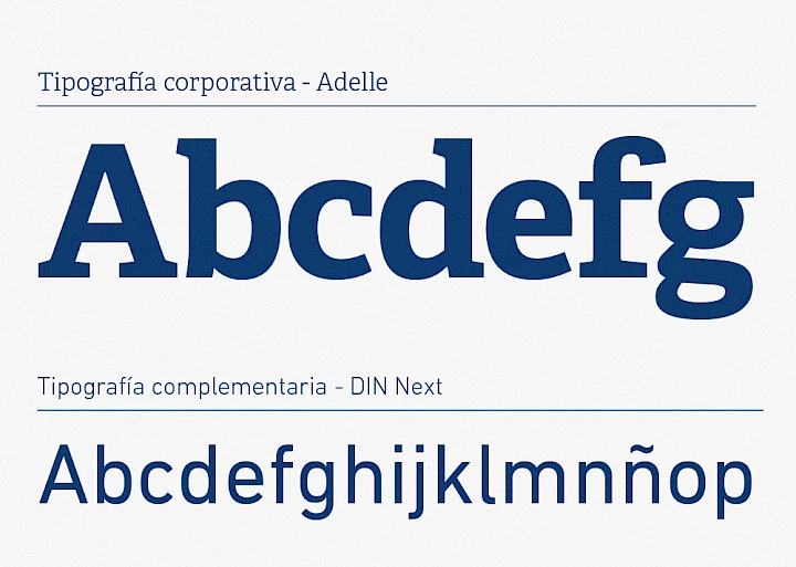
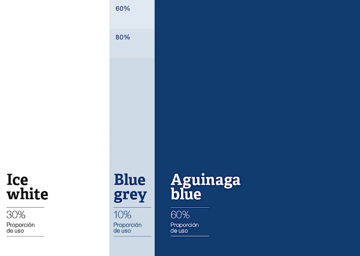
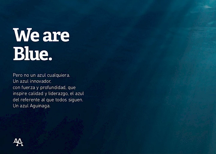
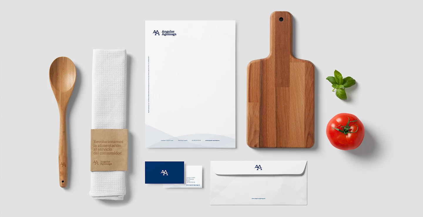
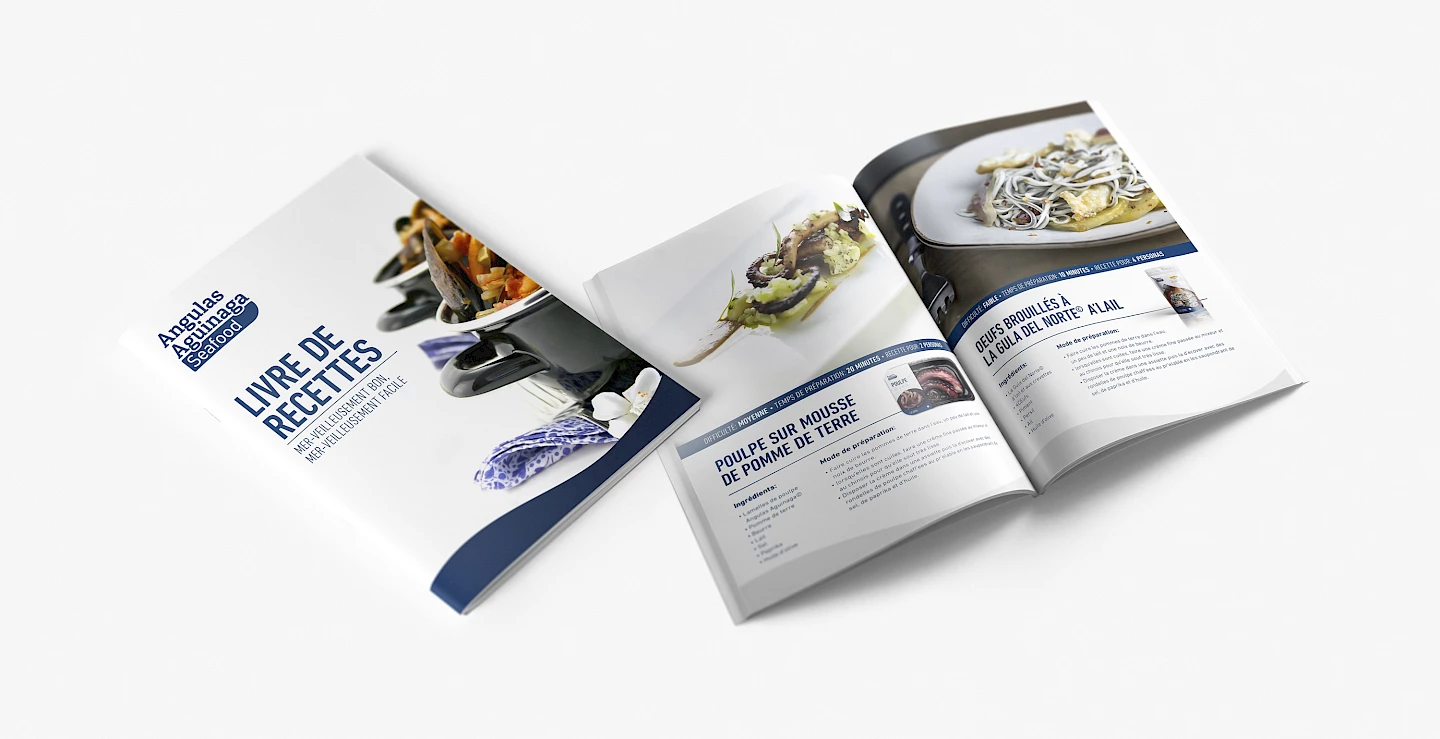
The new identity had to be aligned with its brand pillars: innovation and people. This led us to choose a specific style and typography. After the strategic analysis we concluded that the double A was, and should continue to be, its hallmark.

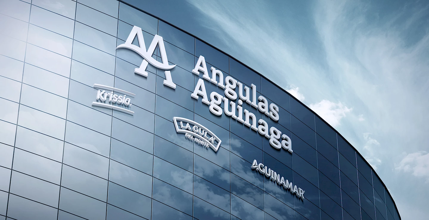
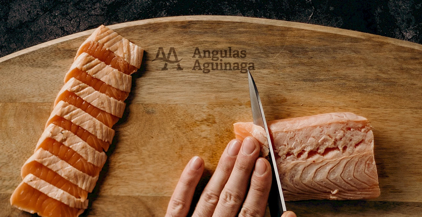
Angulas Aguinaga
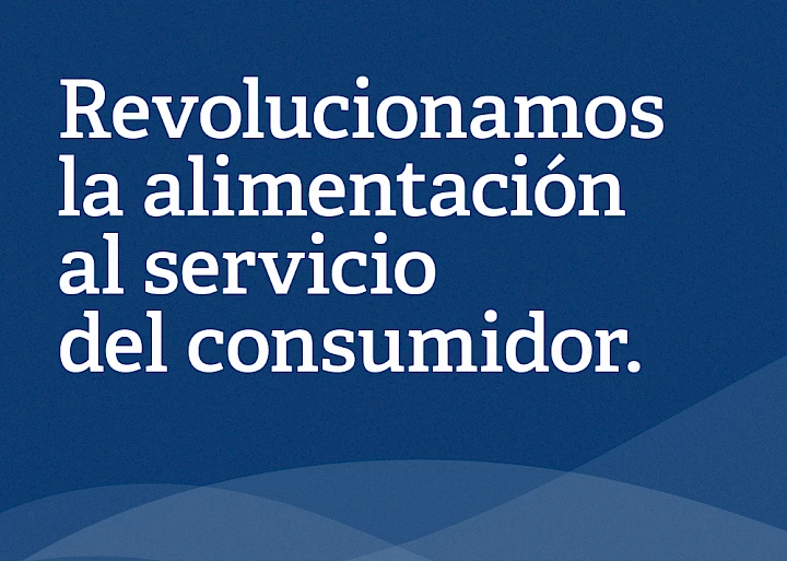
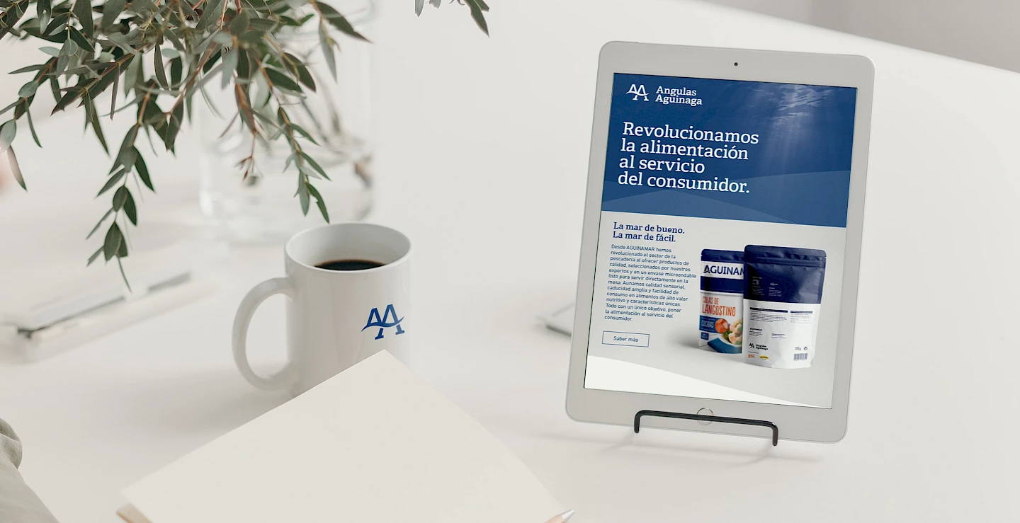
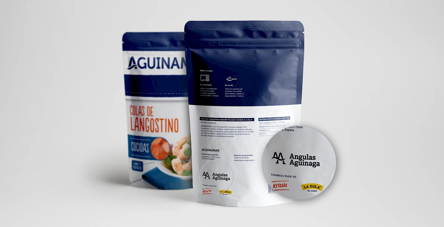
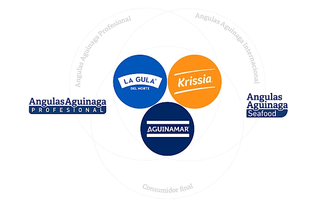
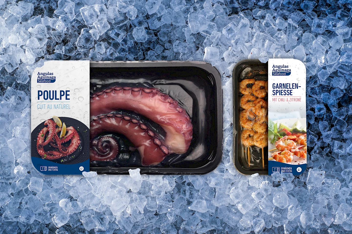
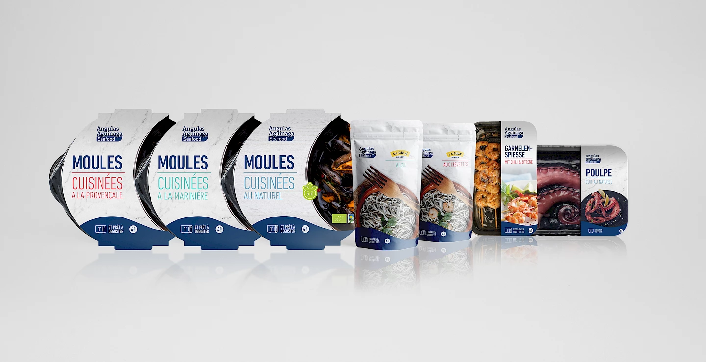
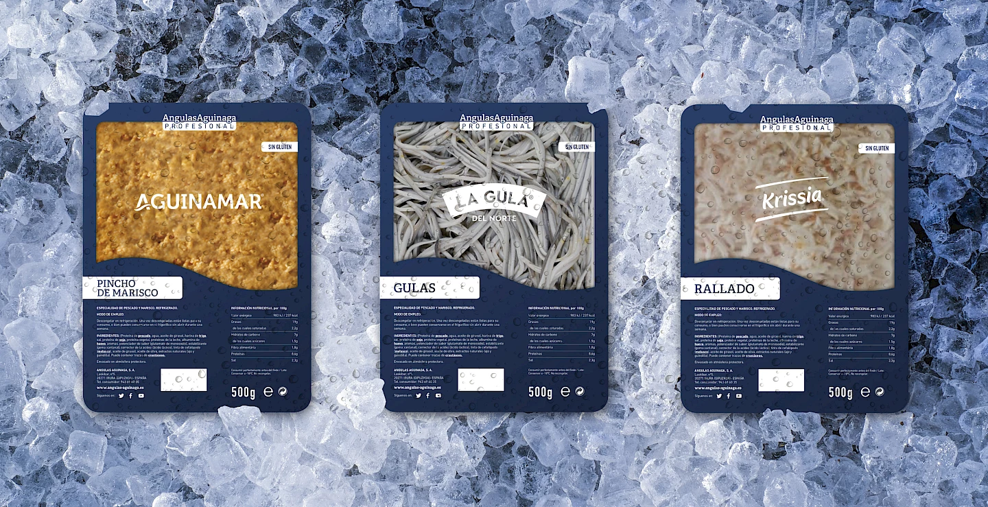
Angula Aguinaga is one of the most important business groups in the international Seafood sector, leaders in modern fishmonger solutions in Spain and a benchmark in innovation and people management in the food sector. It is an innovative company in many aspects: it presents original products, efficient processes and creative designs that many others imitate. Angulas Aguinaga is in full growth and expansion of its business and needs to evolve its brand, strengthen its competitive position to address new segments and markets for growth, beyond the modern fish market in which it is already a leader.


 Contact