Info
move branding 03 cabecera technology ikerlan design

Ikerlan

Transforming the transformer. Sometimes, companies transform themselves so much that they can forget the transformation of their own brand. This is often the case with veteran entities that, thanks to their innovative vocation and entrepreneurial instinct, have managed to adapt to changes in society and the market, but have somewhat neglected their own brand. It is also common in technology companies, protagonists of incredible advances but with brands that do not represent their full potential and capacity.

valores_5 move design technology ikerlan branding

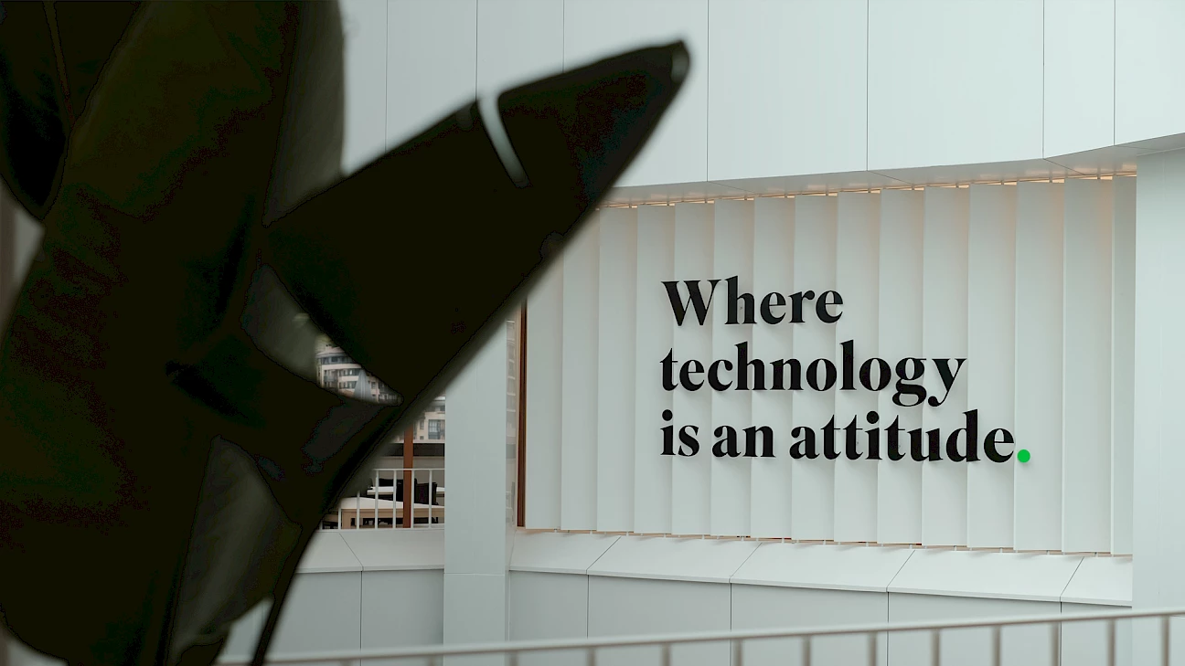
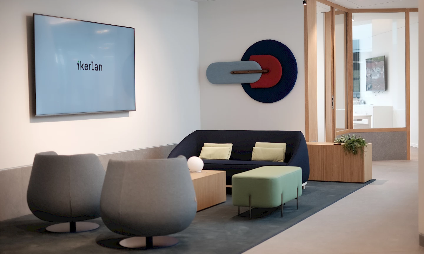
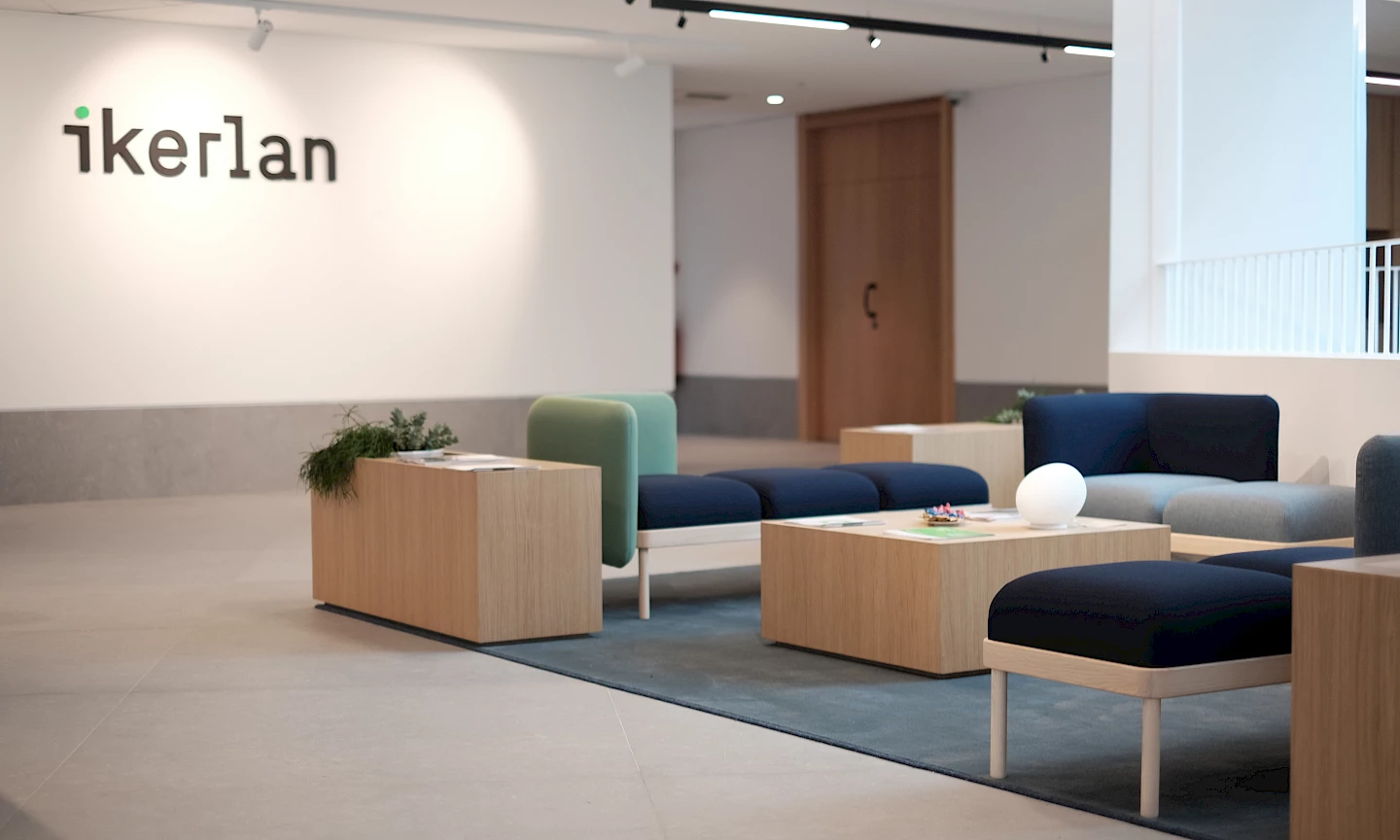
Where technology is an attitude.

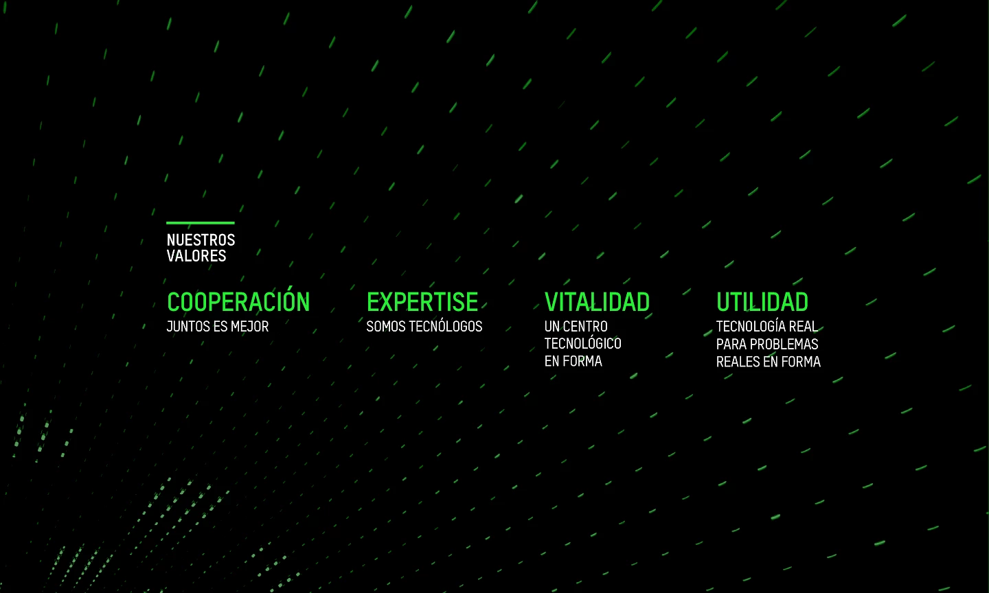
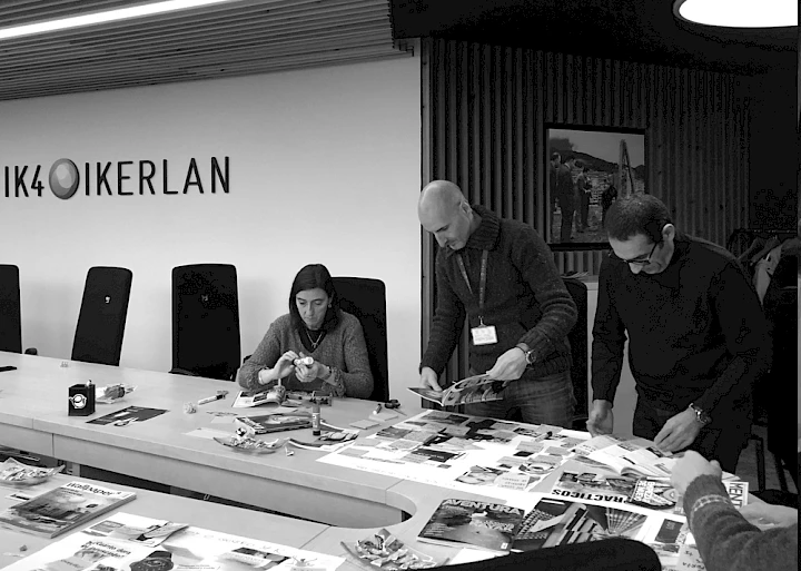
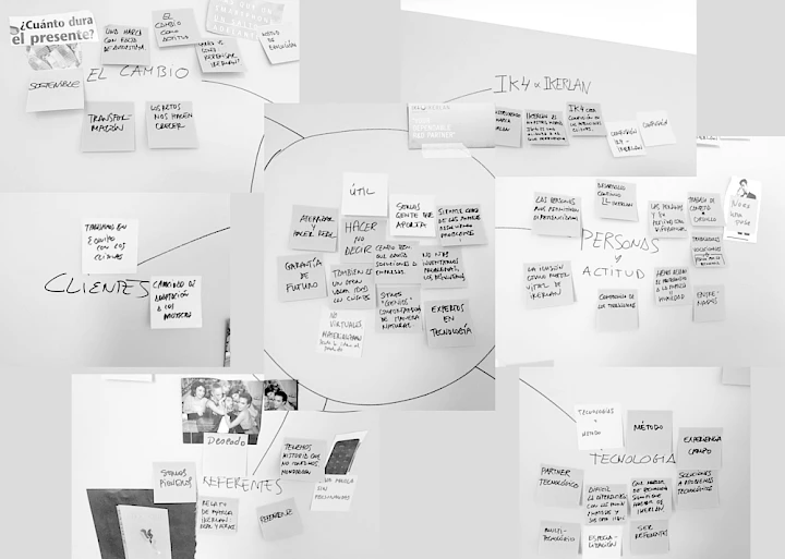
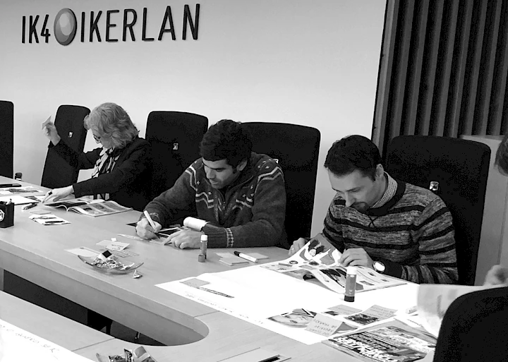
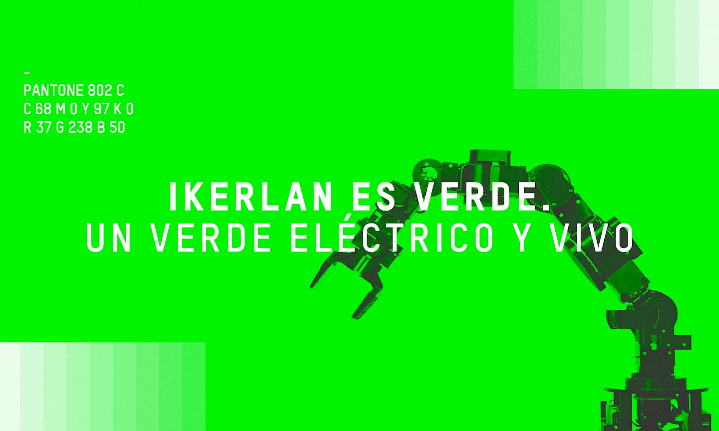
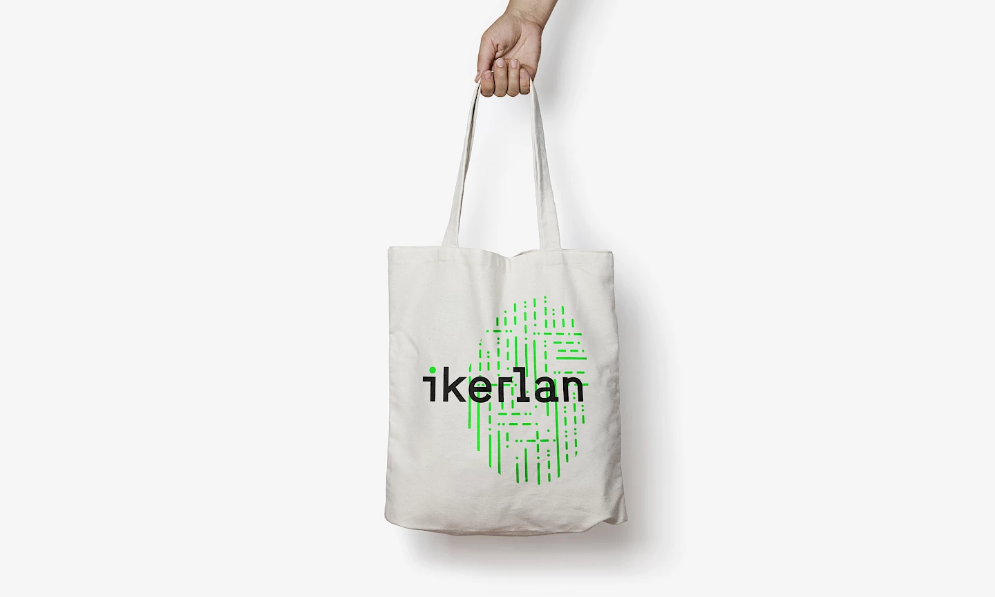
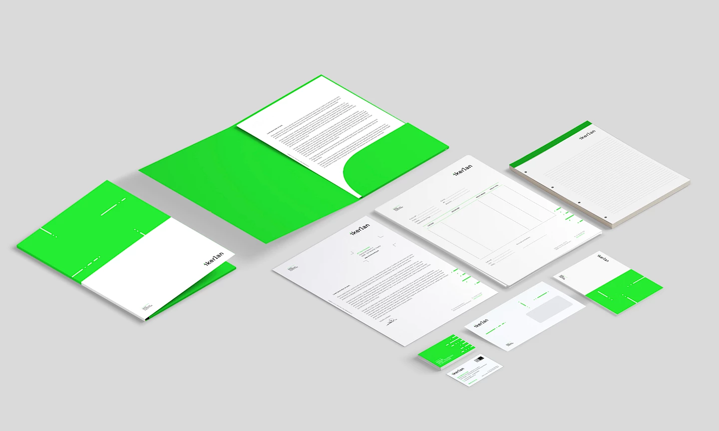
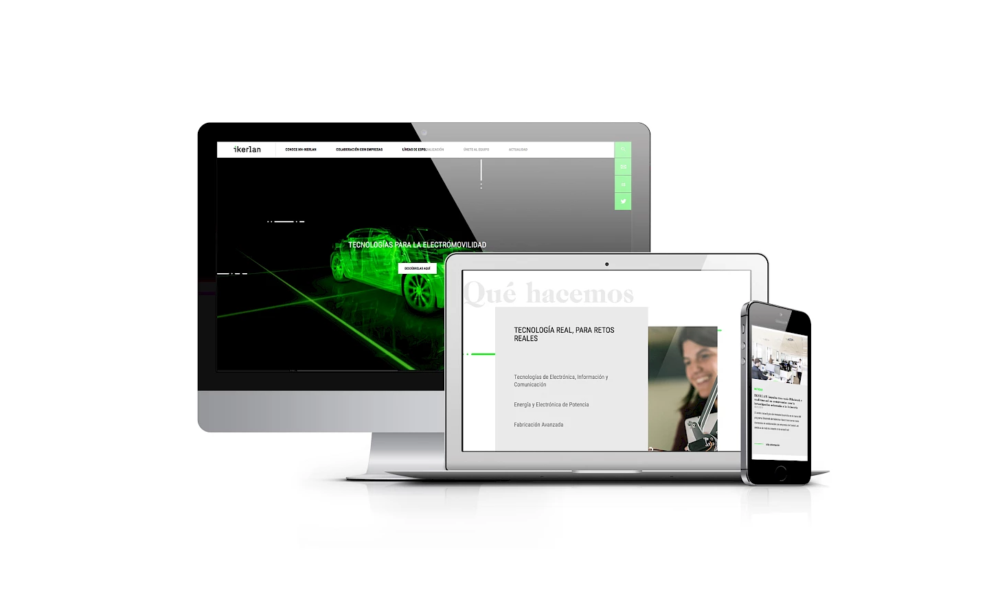
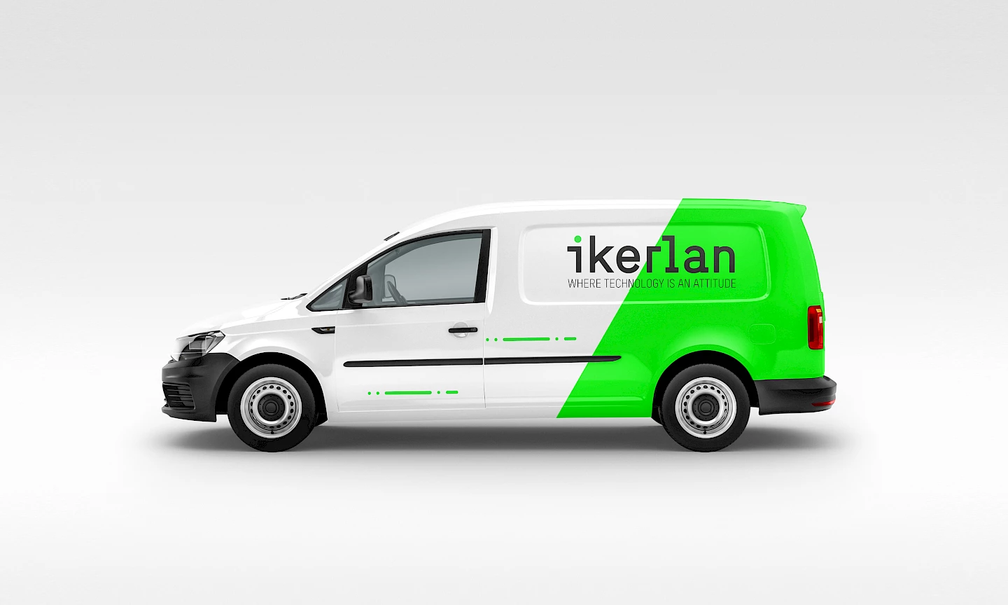
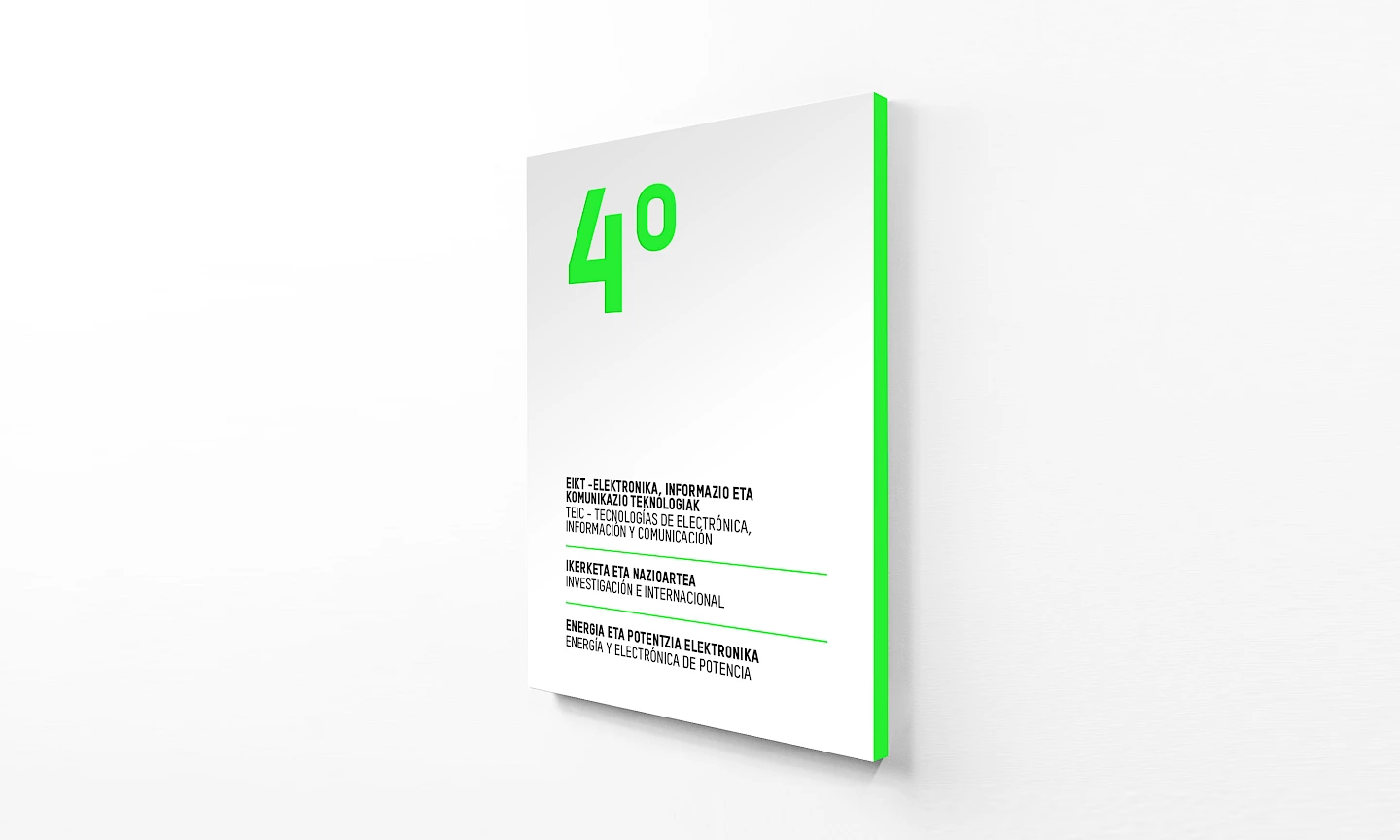
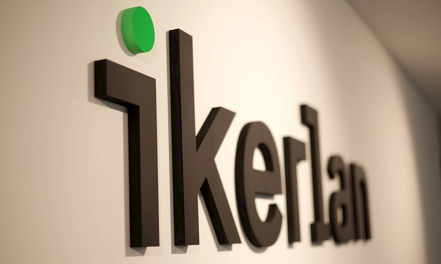
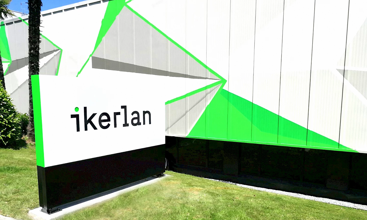
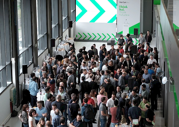
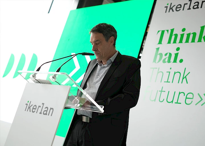
2018 and 2019 have been key for Ikerlan. During 2018 we launched the strategic reflection project for the brand, which crystallised in a new value proposition, a new communication style and a new brand culture. We redefined the values, essence and purpose of the brand. And we implemented different actions to transmit the renewed brand personality. Among them, a new visual style and an enthusiastic corporate colour: fluorescent green. A declaration of intent of what was to come.

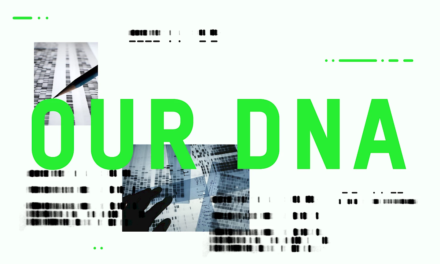
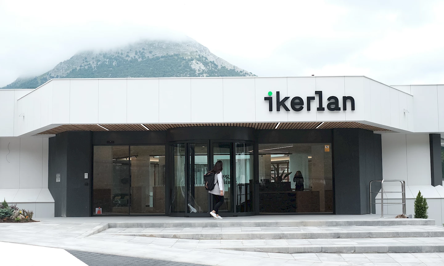
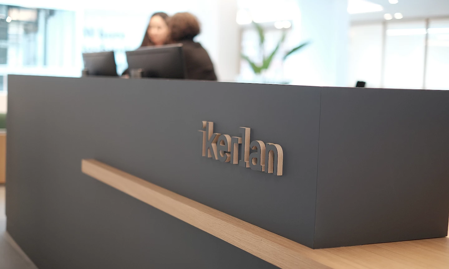
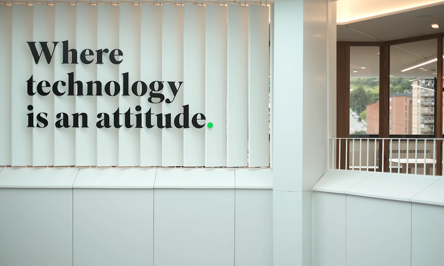
In 2019, it was time to underpin the whole project with the presentation of the new corporate identity. Once the brand's DNA had been defined and deployed in different media, we focused on aligning its new corporate identity with the universe of meaning of the brand claim: "Where technology is an attitude". Or, in other words, the passion with which technology is experienced at Ikerlan, the ability to get involved in the technological challenges of its clients and that special motivation that distinguishes the people who form part of its team.

design technology 03 move ikerlan branding
design technology ikerlan move 05 branding
move 04 branding design ikerlan technology
branding ikerlan design move technology 06
technology dna move branding design ikerlan
branding technology move ikerlan design color3

Dotting the i's and crossing the t's.

Ikerlan is a pioneer and benchmark for its talent, knowledge and ideas. So we started from the iconic representation of the idea (the light bulb) and synthesised its shapes as much as possible until we reached the fluor green dot. That dot and the fluorescent green stand out as visual keys in a light and contemporary brand, with great visual simplicity and a touch of ingenuity, which expresses Ikerlan's innovative, inspiring and non-conformist attitude.

technology idea move branding ikerlan design
logo2 technology branding move ikerlan
design technology move environment_1 branding ikerlan
environment_3 ikerlan design technology move branding
ikerlan branding move design technology environment_2
design move technology environment_4 ikerlan branding
technology design branding ikerlan pictos_2 move
ikerlan environment_5 technology move branding design
branding design ikerlan environment_6 move technology
move technology environment_7 branding design ikerlan

The building is the message.

It is not always easy to demonstrate your corporate philosophy. But at Ikerlan we present indisputable proof: its iconic building, witness and protagonist of its trajectory, and a space that we transformed through a brand environment project, together with Kanpo Arquitectos.

Ikerlan's hexagonal building is, in itself, a manifesto, because it is symbolically based on the company's six most important values: identity, cooperation, transformation, vision of the future, social sensitivity and innovation. And it has yet to face up to its own transformation.

ikerlan technology move environment_8 branding design
ikerlan move technology branding environment_10 design
technology move design environment_9 branding ikerlan
move ikerlan environment_11 design branding technology
ikerlan technology branding design environment_12 move
design branding ikerlan technology move environment_13
design ikerlan move environment_14 branding technology
branding design environment_16 move ikerlan technology

Think bai. Think future.

It is not every day that you present a new corporate identity and the transformation of the building in which you have been staying for 45 years. These important changes in Ikerlan's brand image required a strategic concept that would support them and at the same time transmit the idea of an attractive, different, open to change, creative, modernised company. That intangible something that distinguishes companies that are ahead of the pack. This is how Think Bai was born. To express Ikerlan's attitude and aptitude. To think that it is possible and to make it possible.

Later, Ikerlan also wanted to signify the continuity of its transformative and participatory project until 2024, when it celebrates its 50th anniversary. And Think Bai was joined by Think Future.

08 ikerlan move technology branding design
ikerlan branding design 05 move technology
move technology ikerlan 07 branding design
1 ikerlan design 08 move branding technology

Pride in the brand itself.

The 2019 Assembly was no ordinary event. It had a brand new building and corporate identity, and it was 45 years old. That is why a special event was organised to highlight Ikerlan's capacity for transformation over the years, to celebrate what has been achieved and to make the internal public feel proud to belong.

ikerlan move branding editorial_1 technology design
branding technology design ikerlan editorial_3 move
move branding urteko ikerlan design technology 4 txostena
ikerlan move editorial_8 branding design technology
branding design editorial_6 technology move ikerlan
branding editorial_5 technology ikerlan move design